Subly
Shipped product · Web app
Every recurring charge, in one place.
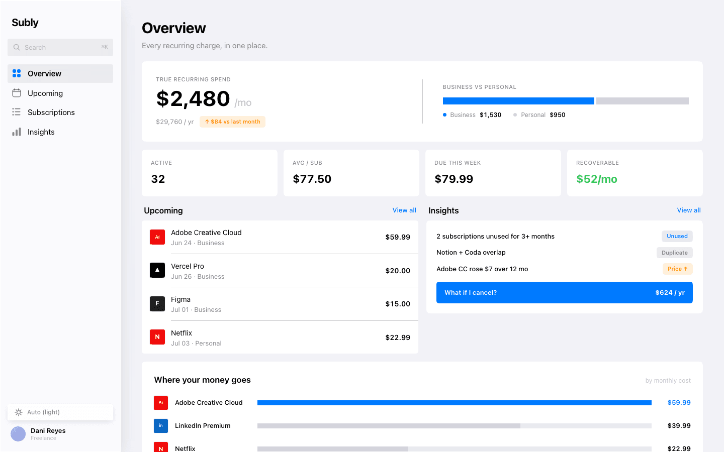
A subscription-leak tracker for freelancers, designed, built and shipped live, where the quiet creep of recurring spend finally reads at a glance.
- Role
- Design + build · shipped
- Scope
- Product design → live app
- Platform
- Web · light + dark
- Year
- 2026
1
token set · two themes, dark mode for free
8.7 / 10
self-run four-round design review, shipped
Live
zero console errors, no overflow down to 375px
Decision
Hierarchy as opacity, not hue.
Importance is encoded in opacity, so the surface stays calm at density and one blue accent is enough for the whole app. The unused subscription is the only coloured thing on the screen. The leak surfaces itself.
Decision
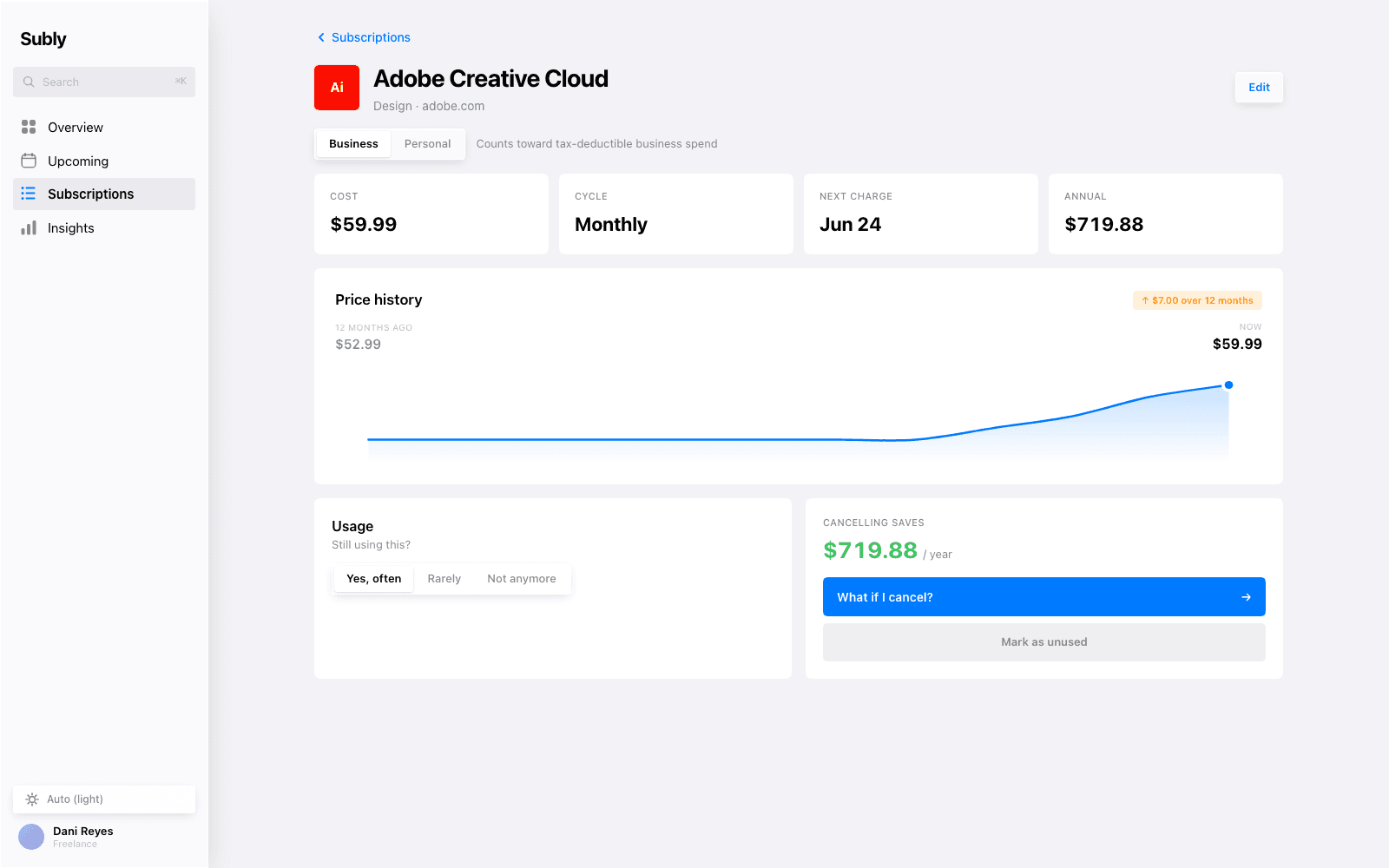
The chart that earned its keep.
A twelve-bar price history read clunky. The series barely moves, so the creep stayed invisible. A smooth area sparkline, y-axis zoomed to the data, made the whole point of the app legible in one small graphic: seven dollars, twelve months.
Decision
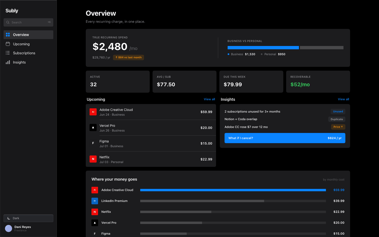
Dark mode fell out for free.
Because hierarchy is tonal, dark mode is the same token set with the ink base flipped, two themes out of one set of decisions, not two designs. prefers-color-scheme is honoured; so is reduced motion.
Process
How it got there.
“The damage is never one big charge.”
The brief · a freelancer’s ~30 subscriptions, business and personal tangled
The finding
A finance dashboard lives or dies on legibility at density. Rather than borrow a look, I committed to a real system’s rules: grouped inset lists, one accent, importance encoded in opacity rather than colour.
Flows
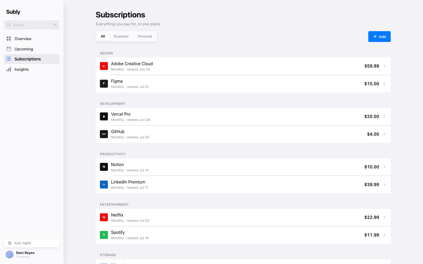
The flow is short by design: Overview, Subscriptions, detail, an honest cancel. The system does the surfacing: the leak is visible on screen one, and every step deeper only confirms it.
Greybox
Two hard calls settled in grayscale before any colour: opacity-as-hierarchy, and the sparkline over twelve near-identical bars. Everything was tested at density. A screen that is calm with three rows is not the test.
System
The most system-forward of the three: a real type ramp, components derived from the platform’s own geometry, and a single tint as the only colour the product spends.
Outcome
The case study is the app. It runs.
It passed a four-round design review at 8.7 / 10, with zero console errors and no overflow down to 375 pixels, and it runs at a live URL, light and dark from one token set. The proof is not a screenshot; it is that it ships.
Eddie Jung · Product Designer · © 2026