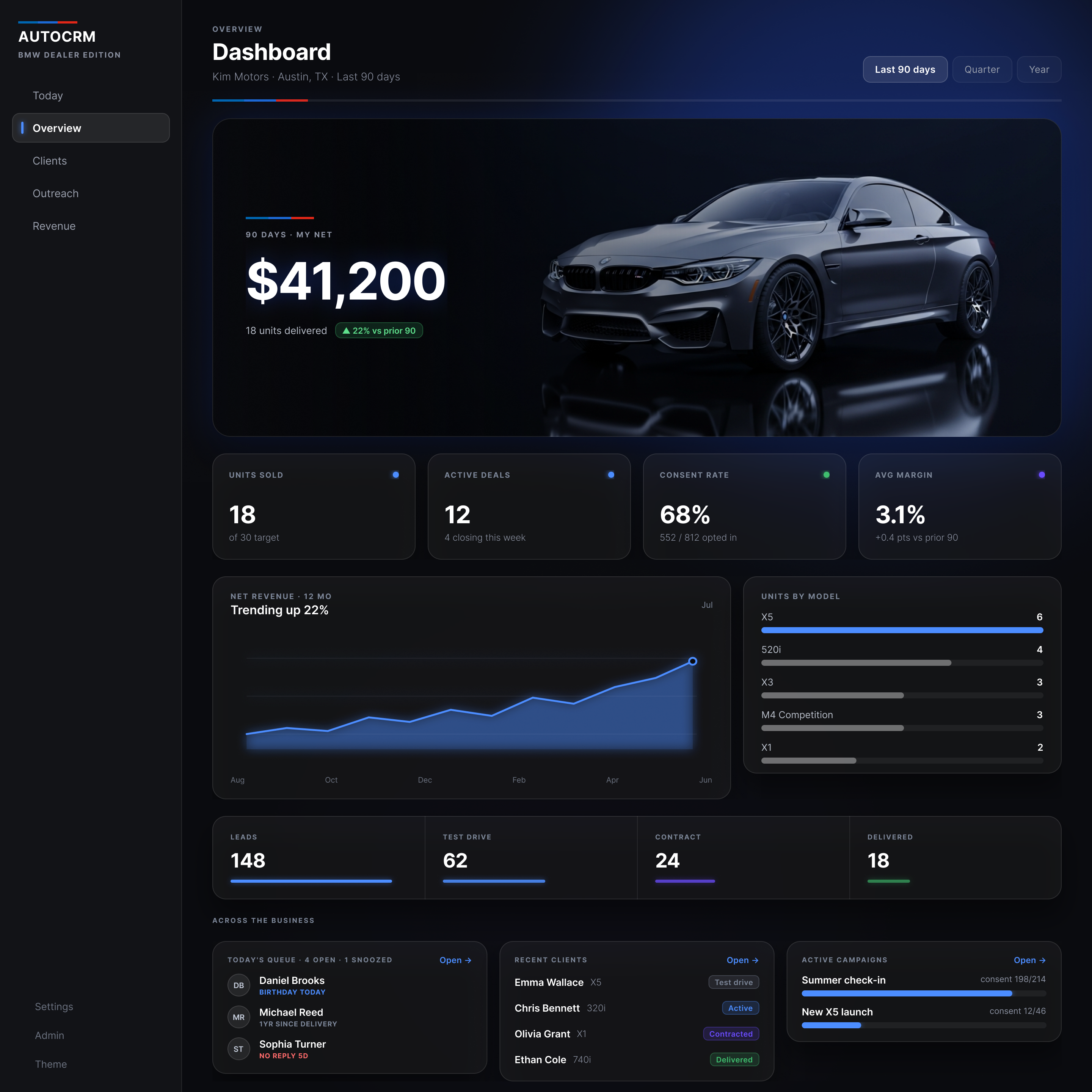
AutoCRM · Dealer CRM · B2B · live product, unshipped redesign
The job was spread across three tools. The money fell between them.
A dealer runs an 800-client book out of a spreadsheet, a phone and a text app. The follow-up that keeps a deal from falling apart lives in whichever one he checked last. Research to working prototype, end to end.
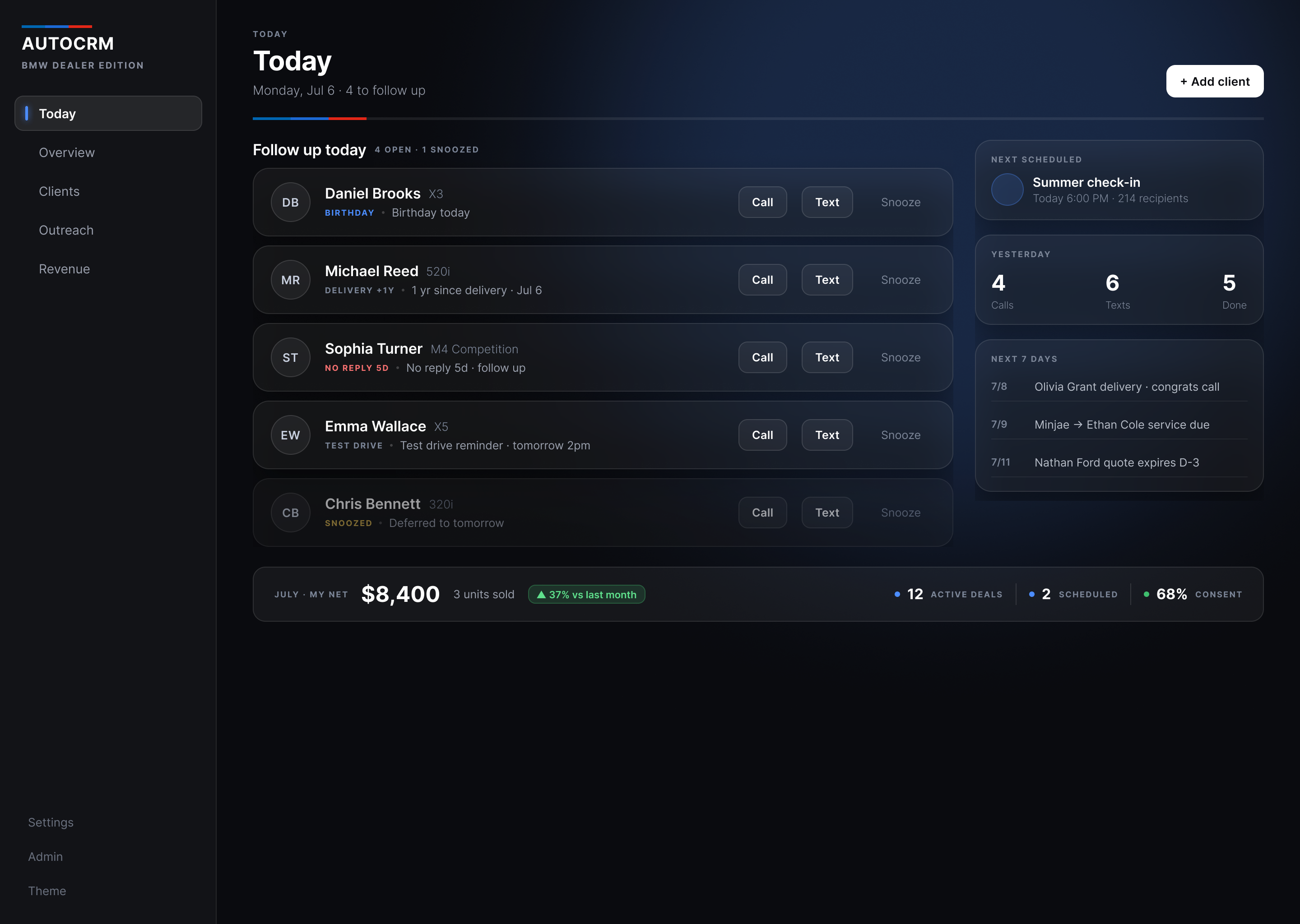
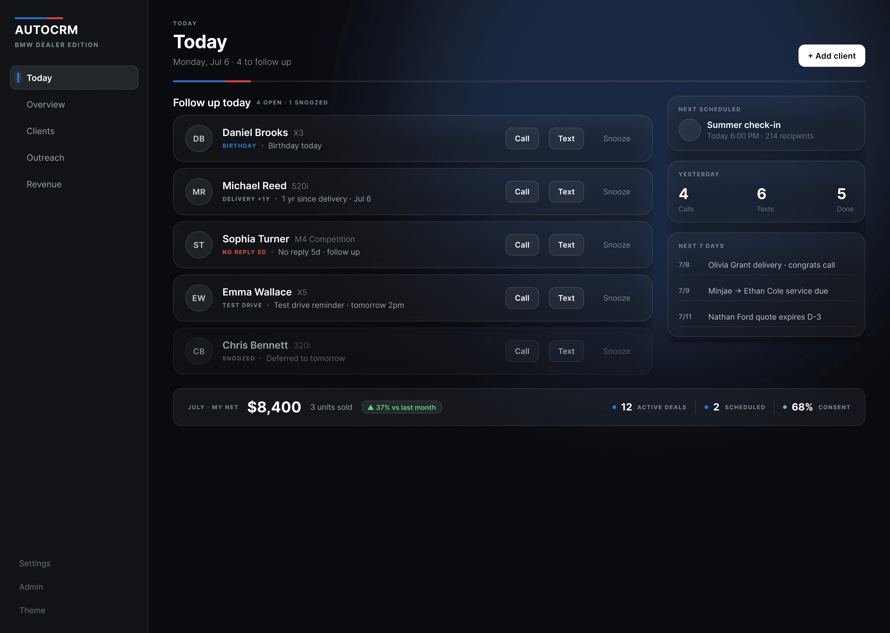
Today
Today
Monday, Jul 6 · 4 to follow up
July so far · my net
$8,400
Active deals
12
Scheduled
2
Consent
552/812
Scheduled
Summer check-in
Today 18:00 · 214 clients
Yesterday
4
Calls
6
Texts
5
Done
Next 7 days
Today, the screen this case argues for. Five names, and each one says why it is on the list.
- Role
- End-to-end UX/UI
- Scope
- Persona → working prototype
- Type
- Live product · redesign unshipped
- Year
- 2026
3 → 1
a spreadsheet, a phone and a text app, folded into one morning loop
15
screens, one dark dimensional system, fully prototyped
incentive − discount
his real net on a deal. The live product was subtracting the discount twice, so the number on his screen was lower than his actual take-home.
TL;DR
Dealerships buy software for the business. Nobody buys it for the salesman, so he runs the part that actually earns money, the follow-up, across three tools that don’t talk to each other. I designed against that: one loop that holds the whole job, without becoming a fourth thing to check.
The problem
Three tools, and the part that earns money sits between them.
The dealership already runs a DMS: inventory, finance, reporting. Useful to the business, useless to the floor. So the closer assembles his own stack. A spreadsheet for the book, his phone for calls, a text app for messages. Nothing connects them, and nothing tells him what today needs.
Neglect is expensive here in two directions. A signed deal can still fall through if the customer goes quiet before delivery. And the repeat purchase, the one that costs nothing to win, comes out of how he handled the year after. Both depend on remembering, and remembering is the first thing a busy month takes.
The standing answer to this is always “a nicer CRM.” The brief I set myself was to interrogate that before drawing a screen, because consolidating four jobs into one app is also the fastest way to build something heavier than what it replaced.
The market agrees, by omission. VinSolutions, Elead and DriveCentric all sell to the dealership, and their own marketing is addressed to whoever signs: reporting, visibility, accountability across the store. I have no adoption data on any of them and will not pretend otherwise. What is plain from the outside is who they are built for. Every one of them competes for the dealership. Nothing competes for the person doing the follow-up. That gap is the product.
How do you hold a salesman’s whole job in one place, without becoming one more tool he has to check?
The anchor persona · a composite, anchored to one real dealer
One salesman decided every screen.
David is a composite, assembled from how dealer salespeople actually describe the job: the spreadsheet workarounds, the DMS complaints, the referral math that lives in their heads. He is anchored to one real BMW salesman, a friend who has been running his book on the live product this case redesigns.
The secondhand half of this is just my reading of the category. Trade write-ups on CRM adoption keep landing in the same place: the tools are built to give managers visibility rather than to make a rep’s day faster, so reps enter the minimum and keep the pipeline they actually trust somewhere else. I am paraphrasing those write-ups from memory and did not run a study of my own. What is first-hand is smaller, and it is the part that actually shaped the product. The one real user kept confirming the pattern in use, and his bug reports turned out to be the sharpest research I had. He could not see a client’s phone number, which told me contact is the whole job. His spreadsheet import failed, which told me day one decides whether he ever adopts at all. That is n=1, and I am not going to call it a study.
David Warren, 45
15 years selling BMWs · ~800 clients across a spreadsheet, a phone and a text app
“The CRM is slower than my spreadsheet.”
David’s line, not a transcript. I wrote it as the sentence the rest of this case has to make false.
- Be told who to reach today, before he has to remember
- Find a name, a model, and a next action in seconds
- Never let a tool slow down a conversation on the floor
Every screen in this case was argued against those three lines. When a frame could not answer them, it did not survive the round.
Patience for software · the design constraint
1 / 5
I made this number up, deliberately, and pinned it at the harshest end of the pattern: one glance too many and he is back in Excel by lunch. Build for someone that impatient and the easier users are already covered.
Second design target · the counterweight
Priya N., 29 · also a construct
The organized rep David is not: two years in, comfortable with software, building a book she will carry to her next desk. Holding her in mind kept two decisions from being about David alone.
Outcomes log themselves, because a rep like David will never stop to type a note. And the consent ledger is there because you cannot legally text a customer who has not opted in. That second one is compliance. I am not dressing it up as something an invented persona asked for.
The deeper finding reframed the whole product: the money came out of the follow-up rather than the first sale, and its timing lived in his head, where a busy month erases it first.
IA · nouns became verbs
The menu stopped naming tables.
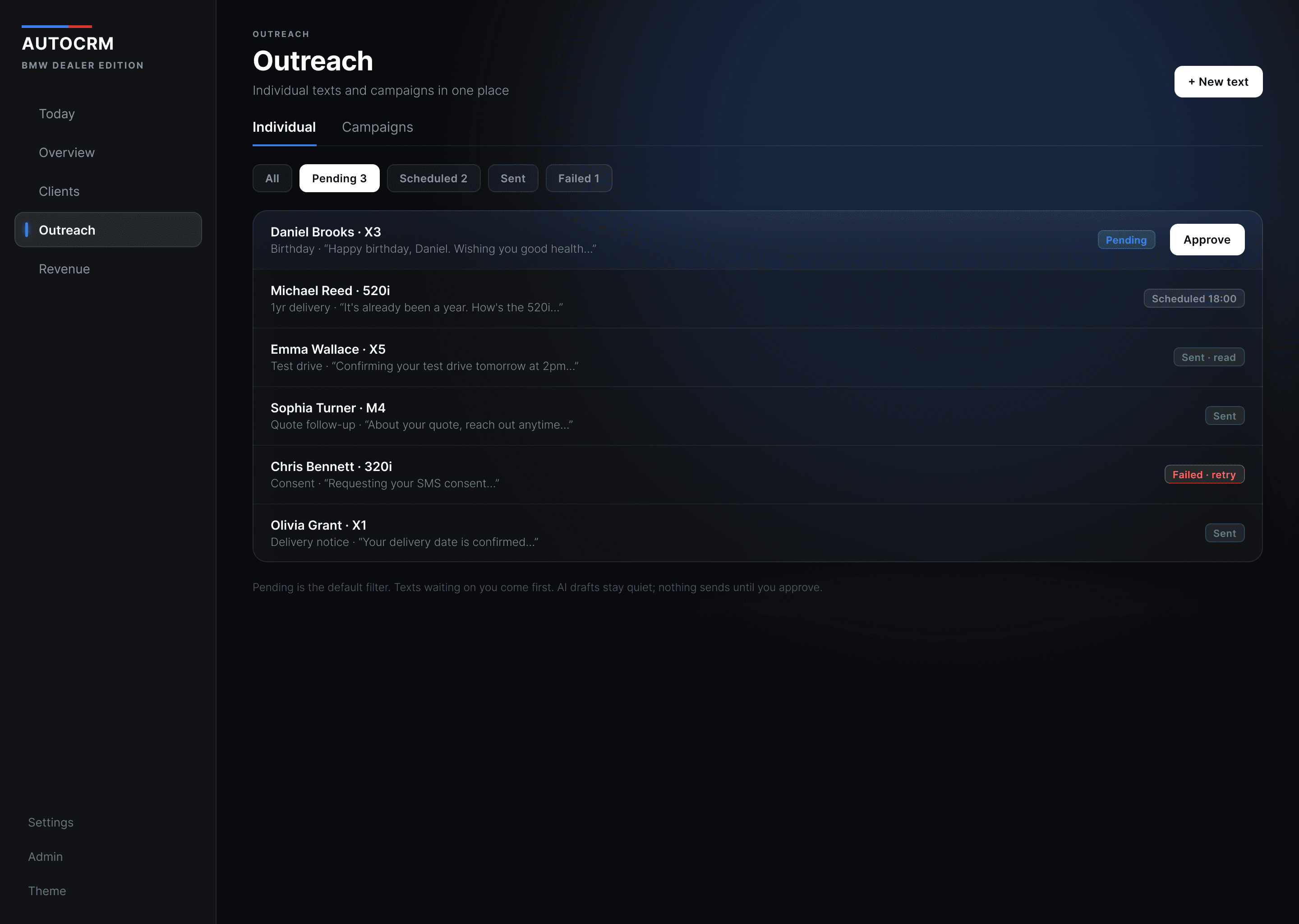
Messages and Campaigns were two menus for the same act, sending something to a customer, and picking between them was a decision the product had no business asking for. They became one thing, Outreach. Today did not exist at all, and now it is the first item in the list.
Before · seven nouns
- Dashboard
- Clients
- Messages
- Campaigns
- Revenue
- Settings
- Profile
After · six, and one of them is a verb
- Todaynew
- Overviewwas Dashboard, demoted
- Clients
- OutreachMessages + Campaigns
- Revenue
- SettingsSettings + Profile
Day zero is its own flow, and it is the hardest screen in the product: his spreadsheets import as-is, columns, duplicates and all, because he will only trust a queue built from his own book.
Greybox · structure before pixels
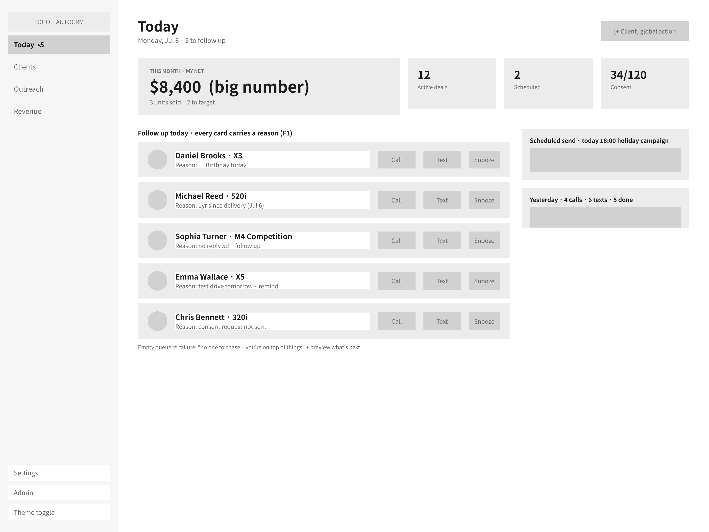
The dashboard lost to the queue.
Two rounds in grey, settled before any of it got expensive to change.
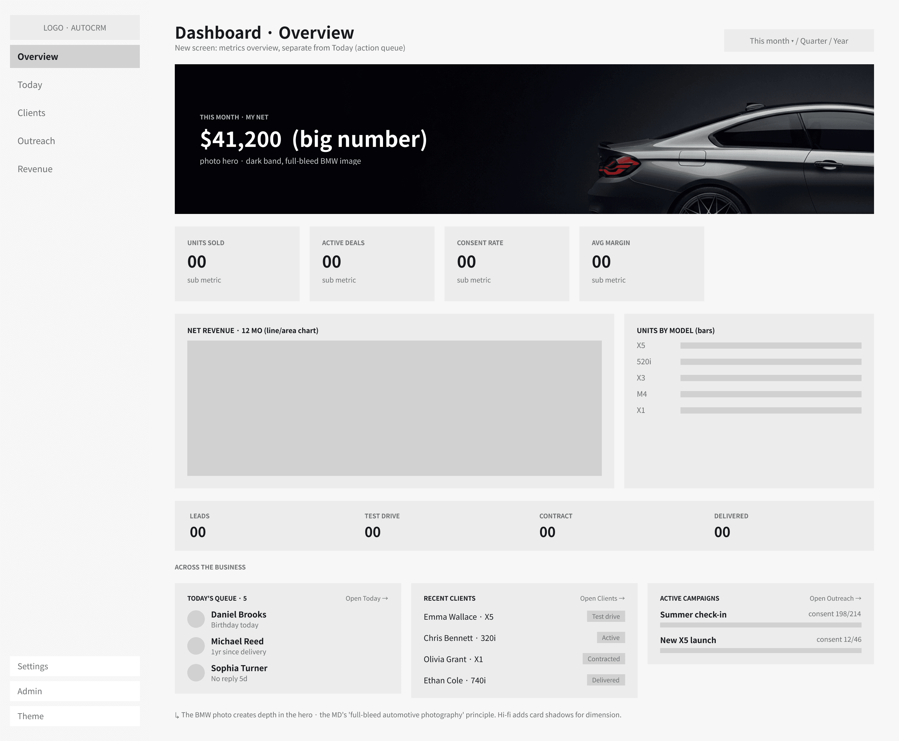
round 1 · rejectedswipe
Dashboard first
The first round led with metrics: a revenue line, units by model, the shape the dealership's own DMS already has. The queue was in there, but as a small widget in the corner under the charts. Round two inverted it. The queue became the screen, and the dashboard moved one click away, renamed Overview.
round 2 · keptswipe
Queue first
The same information, reordered around the morning instead of the month. Every row carries the reason it is there before it carries a button, which is the rule the hi-fi never broke.
Decision
Every card carries its reason.
Today opens on a queue of who to reach, and each name states why: a one-year delivery, a birthday, five days of silence. What makes that order feel like judgment rather than a list is the reason attached to it. A spreadsheet holds the same facts and has no opinion about which of them matters this morning. The app tells him who to call before he has to remember, and an empty queue isn’t a dead end. It’s the reward that sends him back to the floor.
Decision
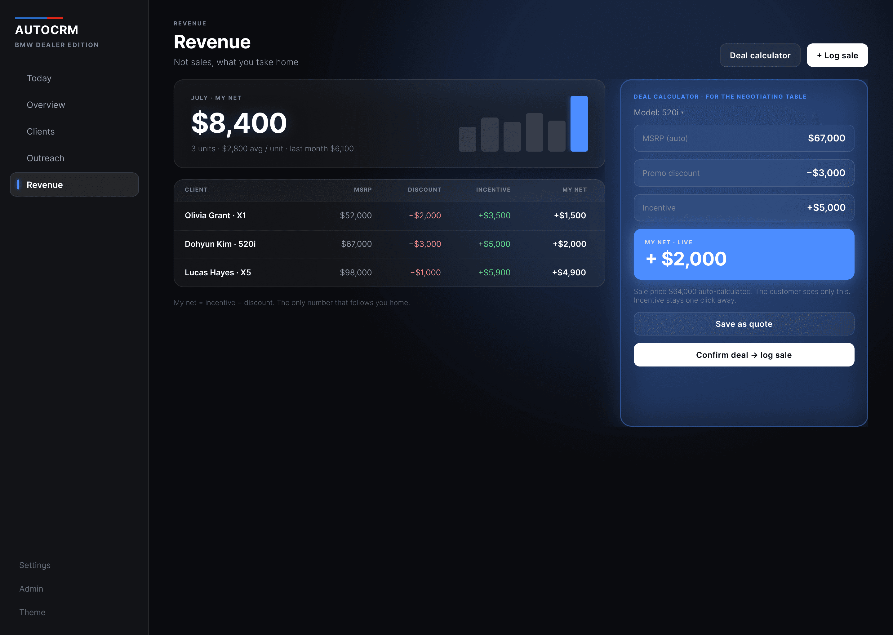
His net, live, at the table.
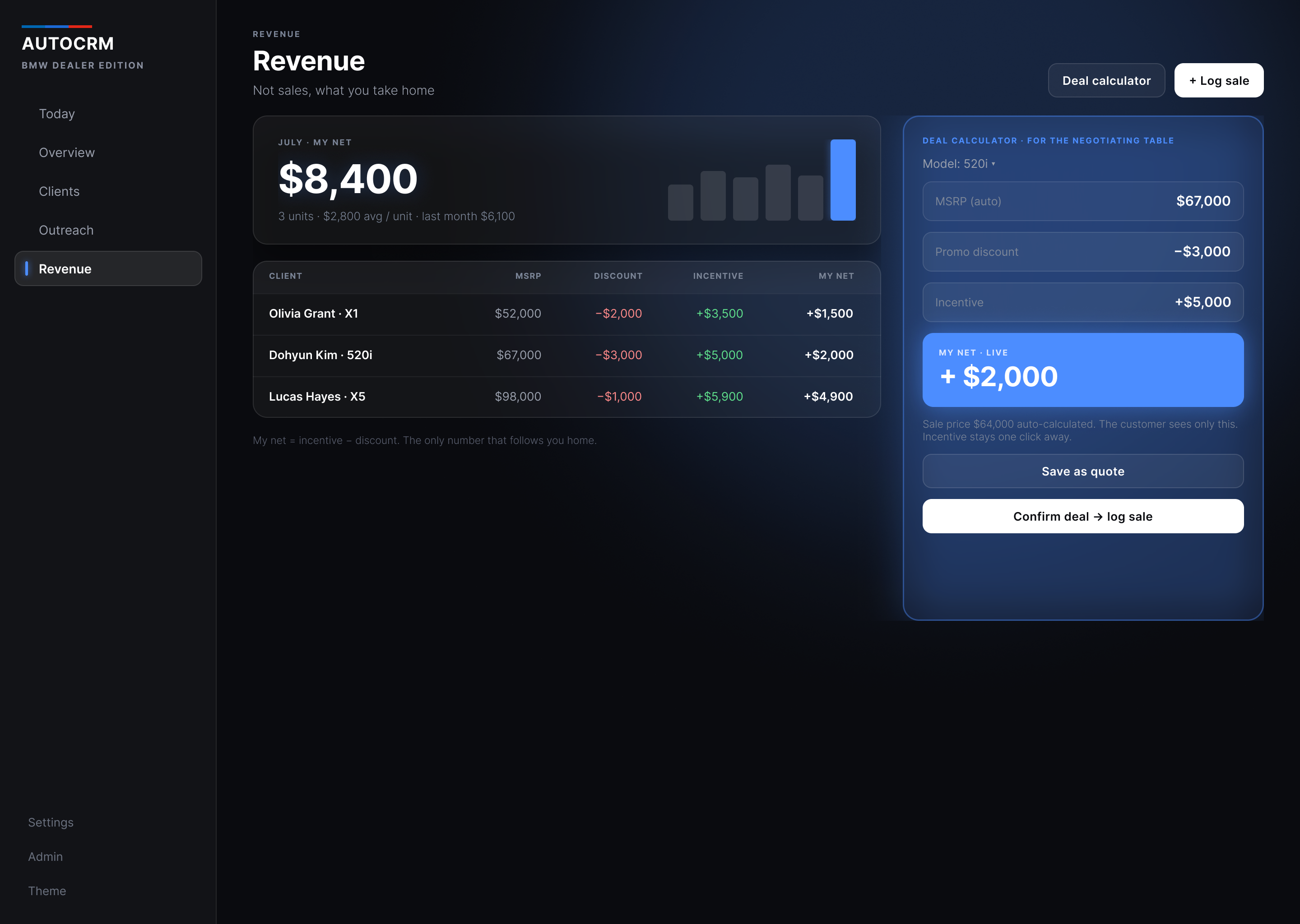
A discount comes out of his incentive, not the company’s margin. That is the pay structure the dealer I built this with actually works under: the factory incentive is his to earn, and every dollar he hands back at the table comes straight off it, so his real net is the incentive minus the discount. The version he had been using subtracted that discount twice, once inside the sale price and again from the incentive, so his screen under-reported what he was taking home. That was a bug in the live product before it was a design decision. The calculator now moves with the price, and the customer never sees it.
Deal calculator · for the negotiating table
Model: 520i
My net, live
+$2,000
Sale price $64,000 auto-calculated. The customer sees only this. The incentive stays a tap away.
Decision
Fifty messages, not one blast.
A birthday or a delivery anniversary is the cheapest reason to be remembered, and a dealer with fifty of them this month writes fifty texts by hand. So he skips it, and the relationship quietly ages out. The tedious part was never sending them; it was starting from a blank message fifty times. So the batch drafts each one against the person it belongs to, their name, their car, the date that triggered it, and hands him something to read and fix instead of something to write. Consent is checked before a name can be selected.
Happy birthday, Daniel. Hope the 520i is still treating you well two winters in.
A year with the X5 today, Olivia. First service is on us whenever you're due.
Happy birthday, Ethan. Say the word if you ever want to try the X3 you asked about.
50 of 57 due this month. Seven have no consent on file and cannot be selected.
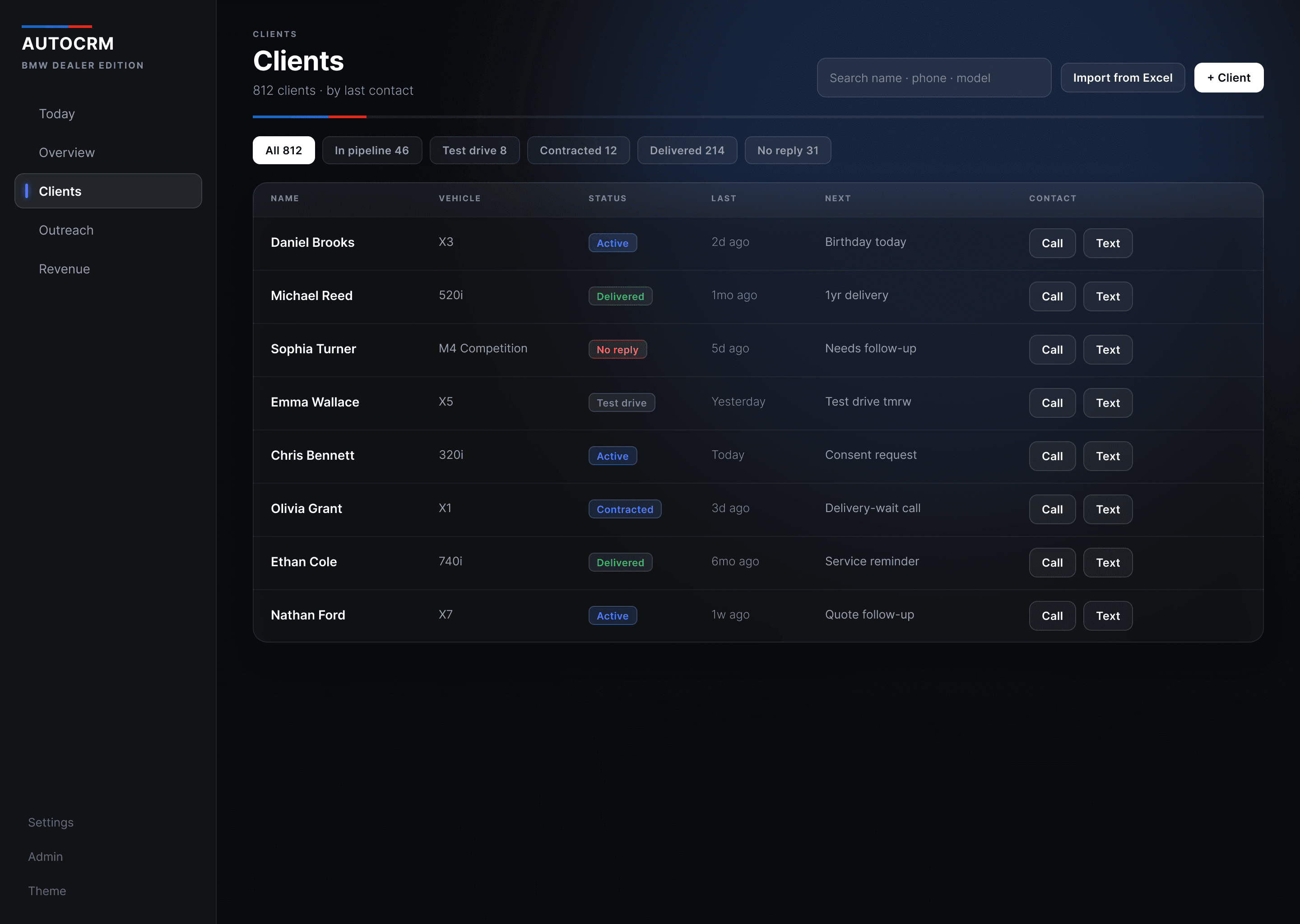
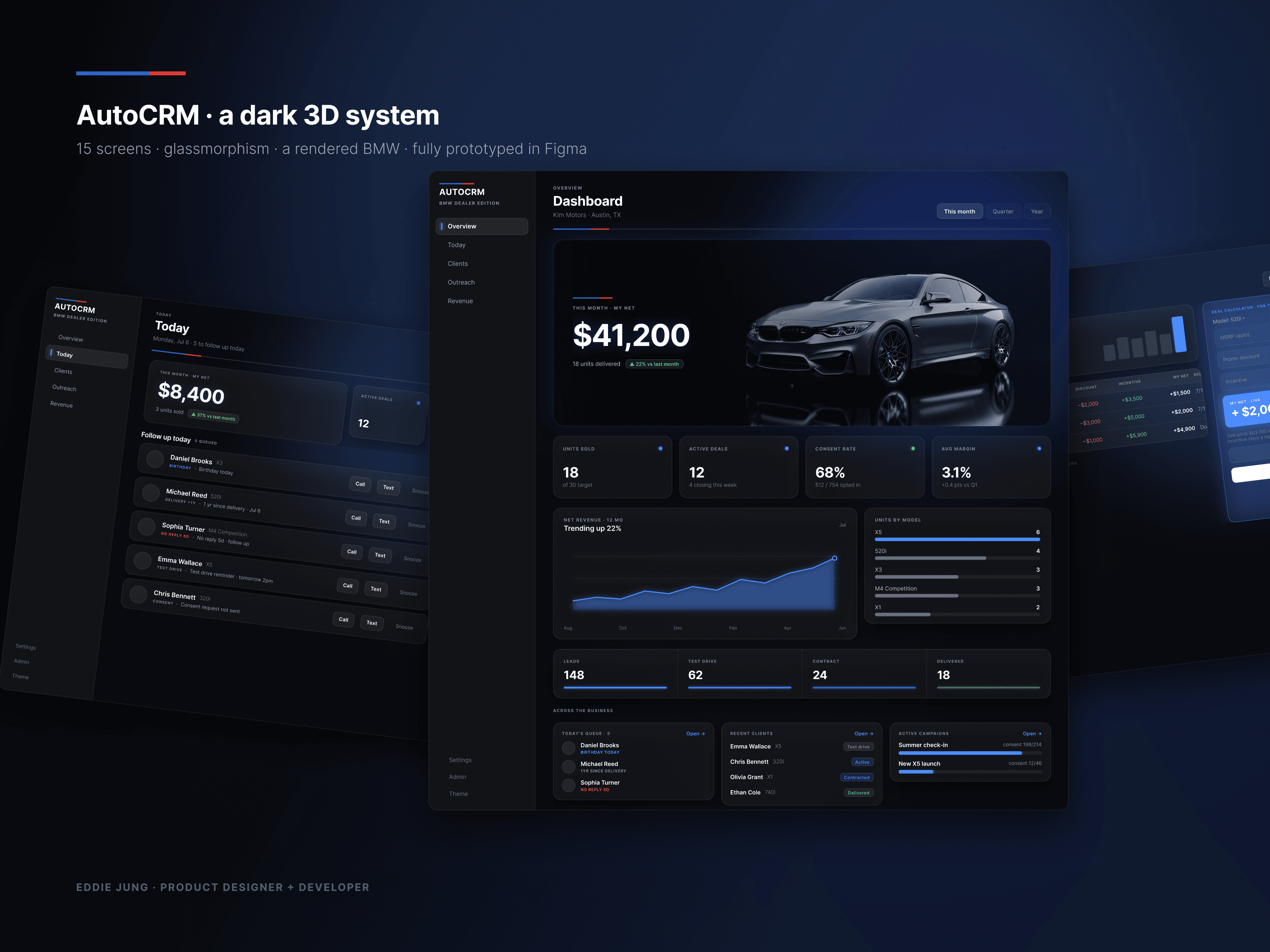
Hi-fi · the full system
One language, held across fifteen screens.
The discipline is holding a system this small that consistently: the BMW-M stripe, a single blue, status the only place colour is spent. It carries dense data without ever getting loud.
The prototype, in your hands
Don’t take my word for it. Run his morning.
Switch screens from the nav. Work the queue. Call or Text logs a name and the count drops; Snooze defers it to tomorrow. Then open Revenue and drag the sliders: his net moves, live. This is the real interface, running in the page.
Today
Today
Monday, Jul 6 · 5 to follow up
What it proves
One dealer uses it. That is the whole sample, and I am not going to inflate it.
The product underneath this case is live, and the parts that carry the argument are ones I built into it: the messaging automation, the margin model that finally computes his real net, the spreadsheet import that decides whether day one ever happens. One BMW salesman has been running his book on it. What you are reading is the redesign that came out of watching that, and the redesign is not in his hands yet, so there is no before and after for me to point at.
What is finished is the argument: a persona sharp enough to say no, an IA settled by one question, two greybox rounds, fifteen hi-fi screens and a working prototype running in this page. The system underneath is deliberately tiny, because folding three tools into one app only earns its keep if the result is quieter than what it replaced. The BMW-M stripe, one blue for every action, the SF type ramp, a near-black surface. Status is the only place colour is spent. The test I would run next is plain enough to fail: does he get through the queue before he reopens the spreadsheet?
Design system
Status is the only place colour is spent.
Surface
Action
Consent
Alert
Reflection
The hardest part wasn’t a screen. It was the messaging automation underneath one, the first thing of its kind I had built, and it kept trying to become the whole product. A feature that costs that much to build wants the front page. But a dealer’s morning is five names with a reason each, and if outreach had swallowed the queue I would have shipped a texting tool with a CRM bolted on. Most of the design work after that was holding it in proportion: automation gets one screen and stays there. What this needs next is not more screens but five ride-alongs and a teardown of the spreadsheets my one dealer still keeps open.
Next case
Petlover
Marketplace · Redesign
Same words. A completely different promise.
View case study
Eddie Jung · Product Designer · © 2026
AutoCRM is a self-initiated redesign of a live product. BMW, the M mark, and model names belong to BMW AG, used nominatively, with no affiliation or endorsement.