Petlover
Marketplace · Redesign
Same words. A completely different promise.
A pet-sitter marketplace re-cut from playful to premium without changing a word of copy or a step of the flow. The harder kind of redesign.
- Role
- Design + build
- Scope
- Redesign · before / after
- Platform
- Web · responsive
- Year
- 2026
10 → 8
home sections, a leaner funnel
7 → 2
brand colours doing the persuading
100%
real photography, no illustration
Decision
One camp, chosen on purpose.
Warm, elevated: “Rover with better taste.” Committing to a single direction gave every later decision one north star: Instrument Serif for display, Figtree for text, a paper ground with one moss and one amber.
Decision
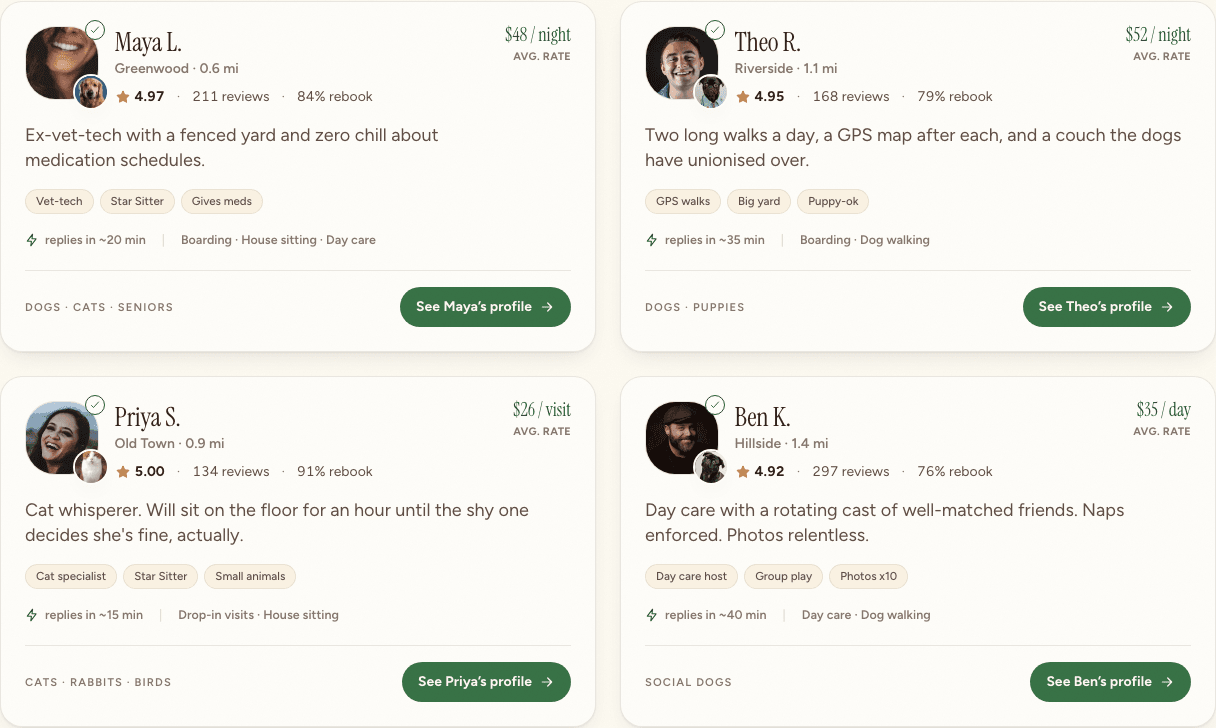
Illustration gives way to real life.
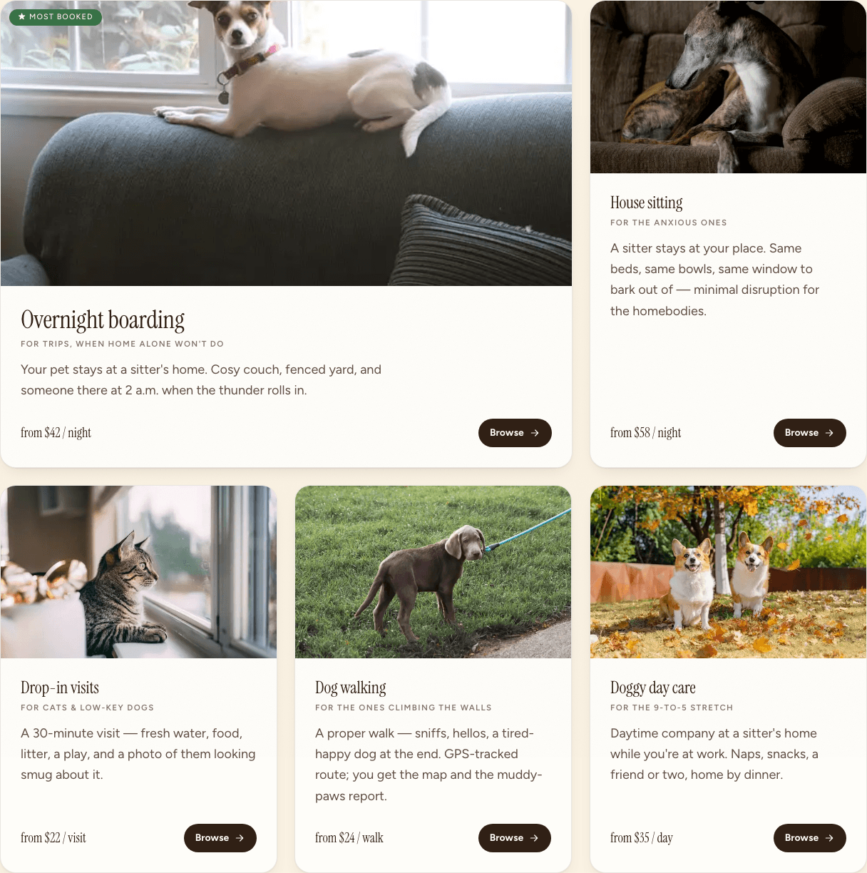
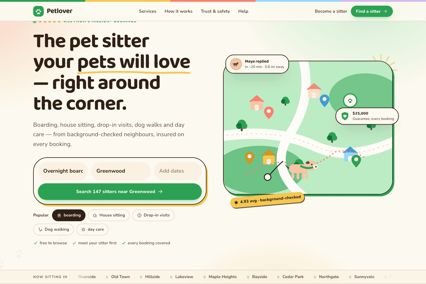
The whole flat-illustration system came out and real photography went in: a background-removed hero dog, sitters photographed with their pets, photo-topped cards. Nothing says “trust me with your dog” like a real one.
Decision
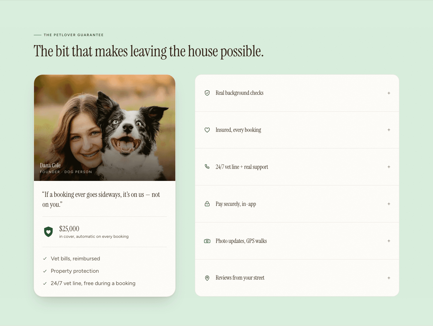
The strongest moves were removals.
Fewer colours, fewer fonts, fewer sections, no cartoons. Every deletion gave the few things that actually build trust, the verification, the real face and the review, room to finally be heard.
Before / after
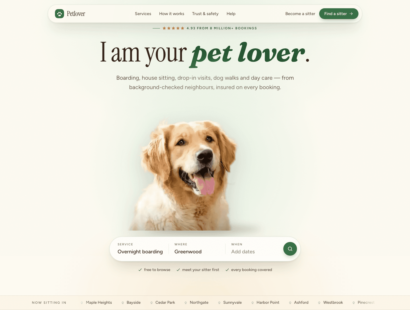
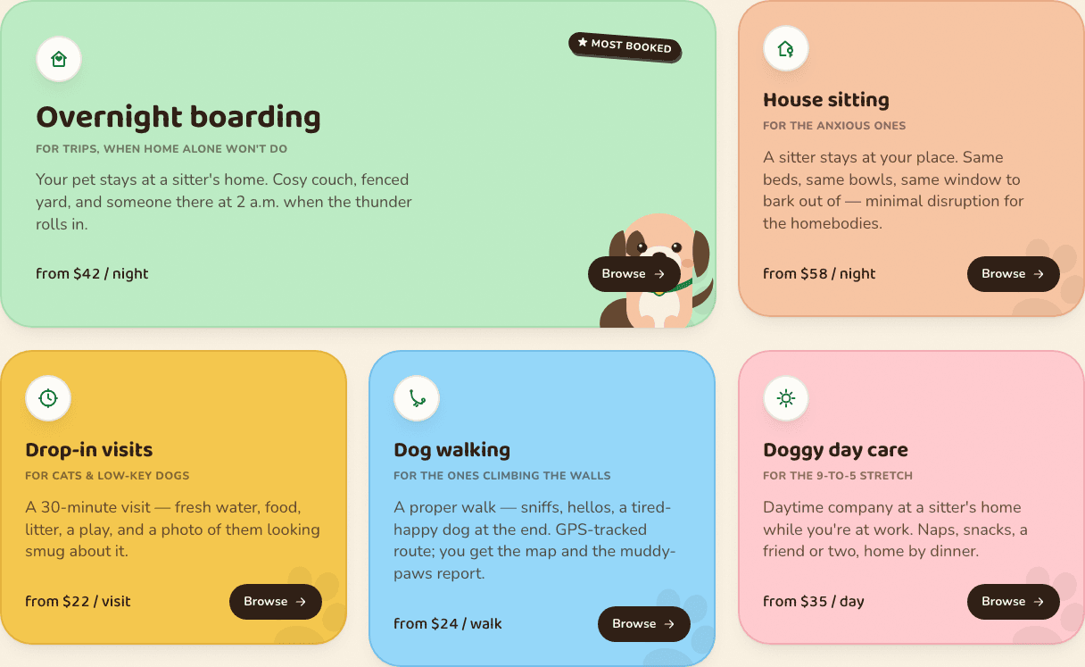
Same words, same flow. Only the conviction moved.
The hero
Services · identical copy, redrawn
Process
How it got there.
“This one, I would actually book.”
A cold read of the redesign, by someone who had never seen either version
The finding
Reading the live page as a nervous first-time booker, nothing was missing. Everything was loud. A page answers “is my dog safe here?” by getting quiet, not by adding another reassurance. The fix was going to be subtraction.
Flows
The conversion flow is untouched: browse, open a sitter, meet or book. That is the whole discipline: keep the path a returning user knows, and change only how much they believe it along the way.
Greybox
Foundation first: type system, colour tokens, nav and footer rebuilt before any section, so everything downstream inherited the new language. Seven candy colours became paper, moss, and amber.
System
The whole system is a subtraction: two typefaces, three colours, one radius. Warmth does the persuading that seven candy colours used to shout for.
Outcome
A redesign is not a reskin.
Identical copy, identical flow, and a first impression that moved from “cute app” to “service I would pay for.” The strongest change was removing, so the few things that actually build trust could finally be heard.
Eddie Jung · Product Designer · © 2026